Avoid fixed height in CSS layouts
Table of contents
In this post we will discuss a common beginners mistake in CSS layouts - using fixed height for elements which may cause maintenance problems in the future. I hope providing a few examples will help people avoid these mistake and improve their CSS layouts' quality and maintenance.
Example 1 - menus
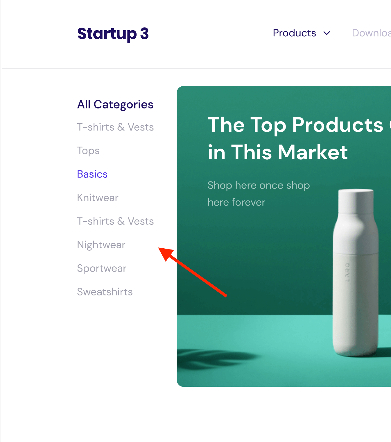
Let's start with a simple example - a menu bar with a few links.

I saw a lot of times when such menu block was laid out with fixed height, like this:
.menu {
  list-style: none;
  /* ... more CSS rules */

  /* fixed height */
  height: 247px;
}
This is a bad practice, because it makes the menu block inflexible. If you add a new link, or change the font size, or change the padding - you will have to adjust the height manually. This is a maintenance nightmare.
The height rule can be dropped here completely - the menu will look exactly the same and browser will adjust the height according to links amount inside.
Example 2 - images
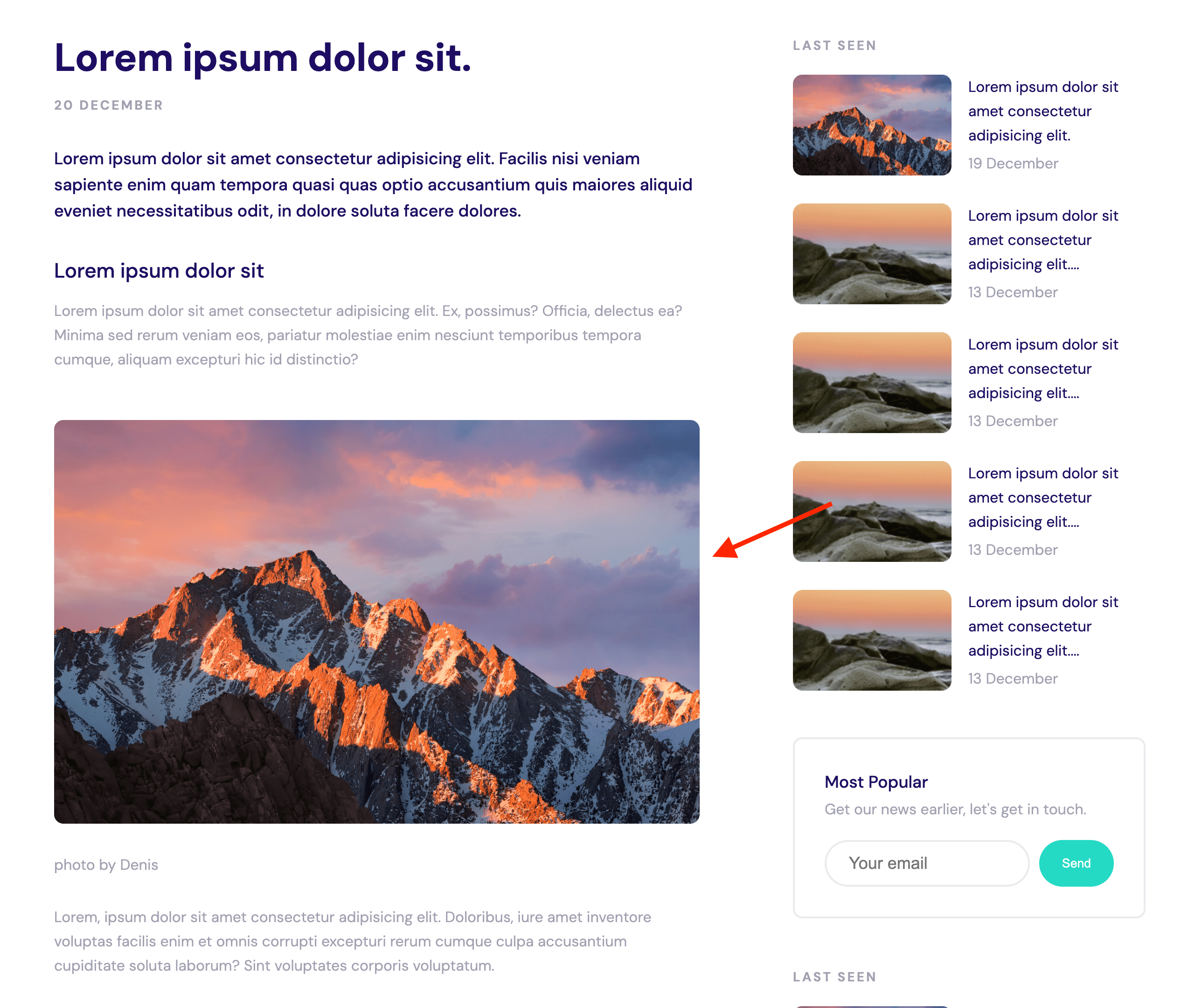
Another example is adding fixed height to images, like in this blog page, for example:

Let's consider the following CSS:
.blog-page__image {
  border-radius: 10px;
  margin-bottom: 26px;
  /* fixed sizes */
  width: 700px;
  height: 400px;
}
There are a few problems with this approach:
- The image is not responsive. If the screen is smaller than 700px (plus sidebar width), the image will overflow the screen.
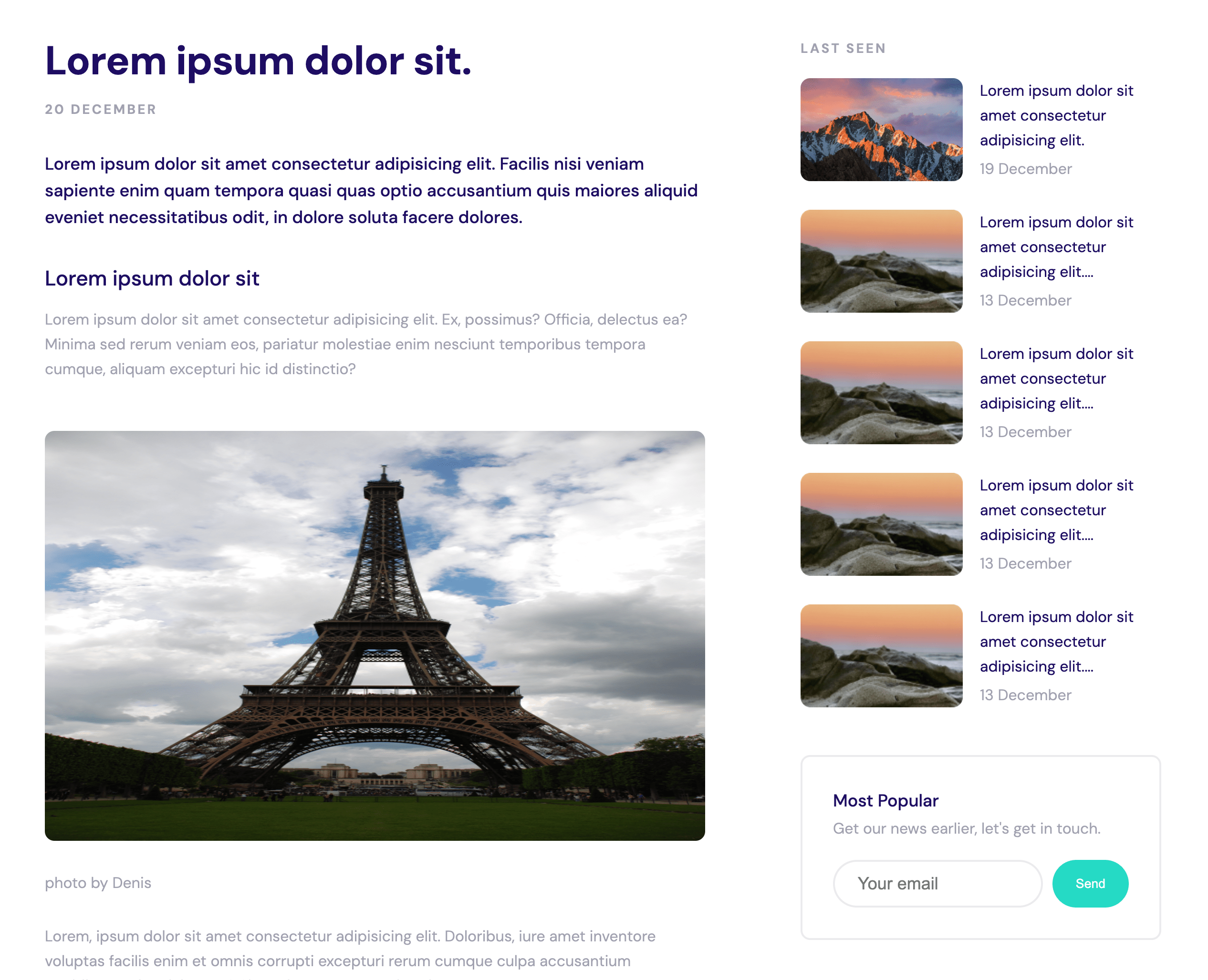
- Adding a new image with different dimensions (aspect ratio) will cause image to look distorted, like this (vertical image added to the post):

In most cases having just width: 100%; rule without height is enough and the image will look good on any screen size.
Example 3 - Fixed images size but different aspect ratios
Let's consider another example. Sometimes it is required to have fixed width/height for images by design but the backend system may provide images with different aspect ratios (e.g. content managers uploaded wrong image via CMS).
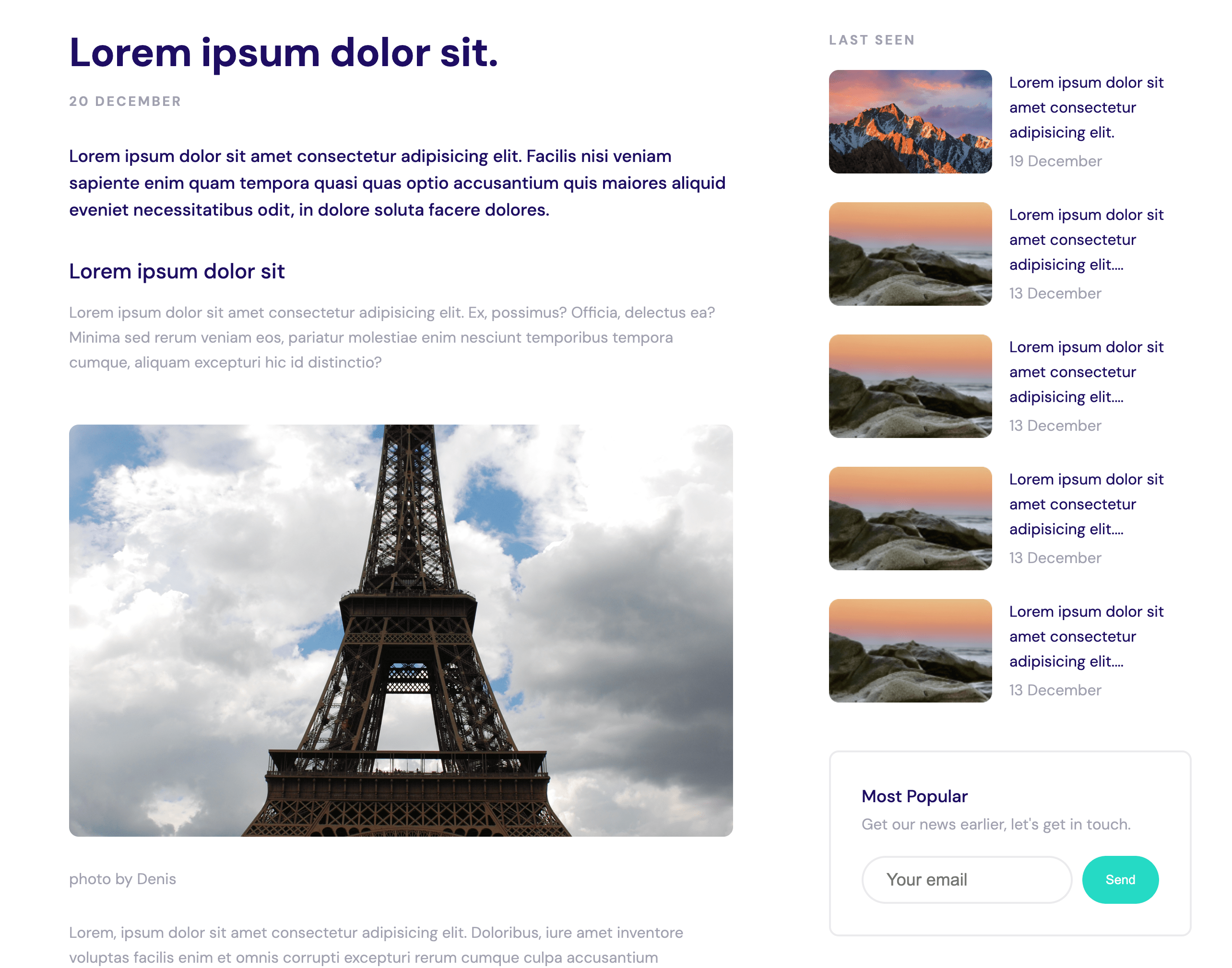
To solve this problem, we can use object-fit CSS rule. It allows to specify how the image should be resized to fit the container.
.blog-page__image {
  border-radius: 10px;
  margin-bottom: 26px;
  width: 700px;
  height: 400px;
  object-fit: cover;
}
So the image from previous example will look like this:
